
Web Redesign
Improving UX and conversion flow for a posture correction startup
Improving UX and conversion flow for a posture correction startup


A Taiwan-based startup focused on posture correction and body alignment. The existing website had cluttered content, unclear navigation, and inconsistent layout across devices, making it difficult for new visitors to understand the service and convert.
A Taiwan-based startup focused on posture correction and body alignment. The existing website had cluttered content, unclear navigation, and inconsistent layout across devices, making it difficult for new visitors to understand the service and convert.
Role
Role
UX/UI Designer
UX/UI Designer
Goal
Goal
Restructure content hierarchy, clarify CTAs, and improve layout consistency across devices
To improve the user experience by creating a dashboard for better investment tracking
Problem
Problem
Designed for mobile, the desktop layout stretched awkwardly and key messaging got buried in repetitive copy
Designed for mobile, the desktop layout stretched awkwardly and key messaging got buried in repetitive copy
Tool
Tool
Figma, Notion, Google Docs
Figma, Notion, Google Docs
User Interviews
User Interviews
Interviewed 7 users with active fitness routines to understand how they discover and evaluate posture correction services.
Interviewed 7 users with active fitness routines to understand how they discover and evaluate posture correction services.

Key Insights
Key Insights
Desktop layout stretched content horizontally, making pages hard to scan
Desktop layout stretched content horizontally, making pages hard to scan
Users don't connect posture correction to their existing fitness goals
Users don't connect posture correction to their existing fitness goals
Users want both online and in-person options, not one or the other
Users want both online and in-person options, not one or the other
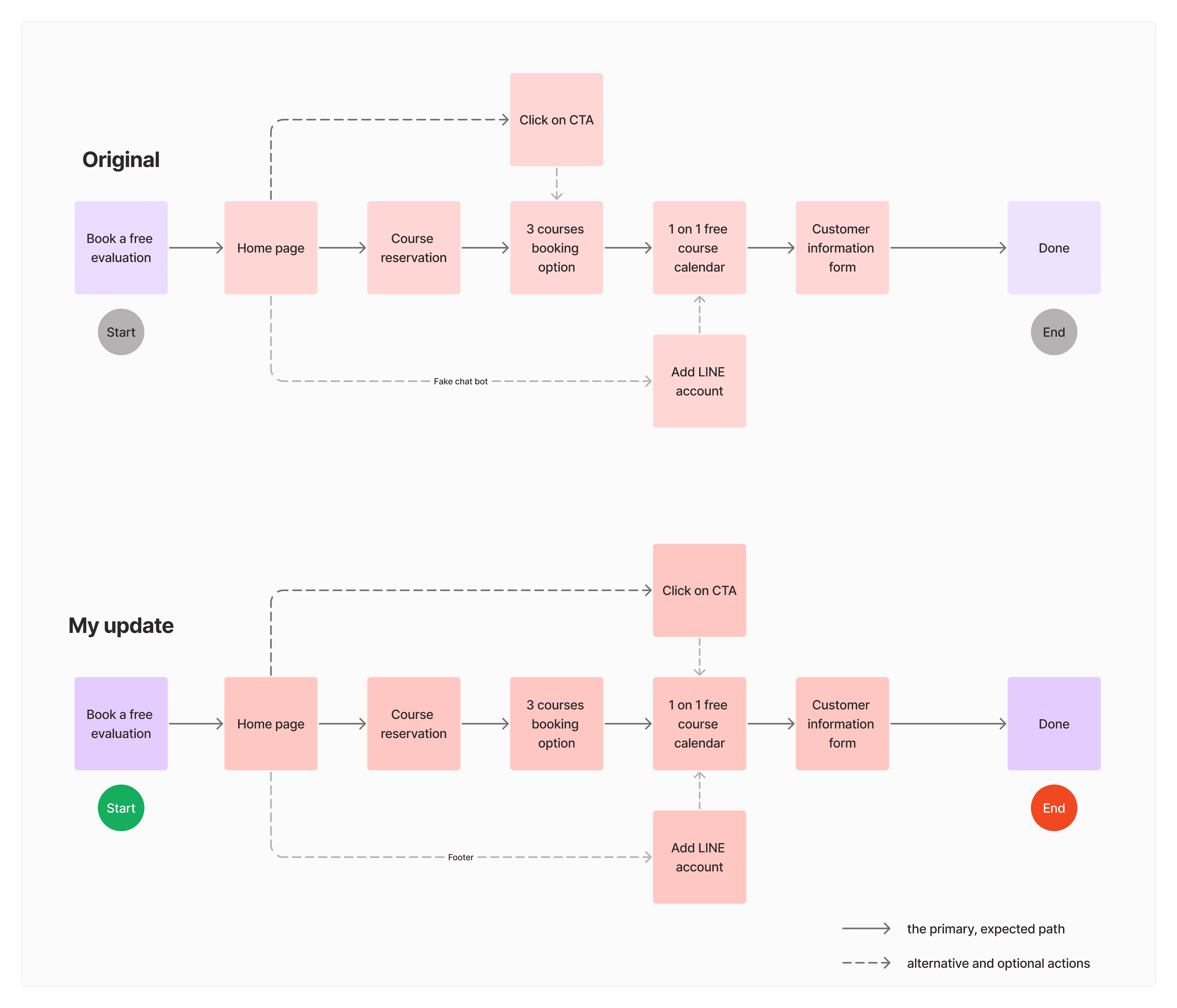
User flow
User flow
Mapped the existing flow to identify where users lost direction or dropped off.
Mapped the existing flow to identify where users lost direction or dropped off.
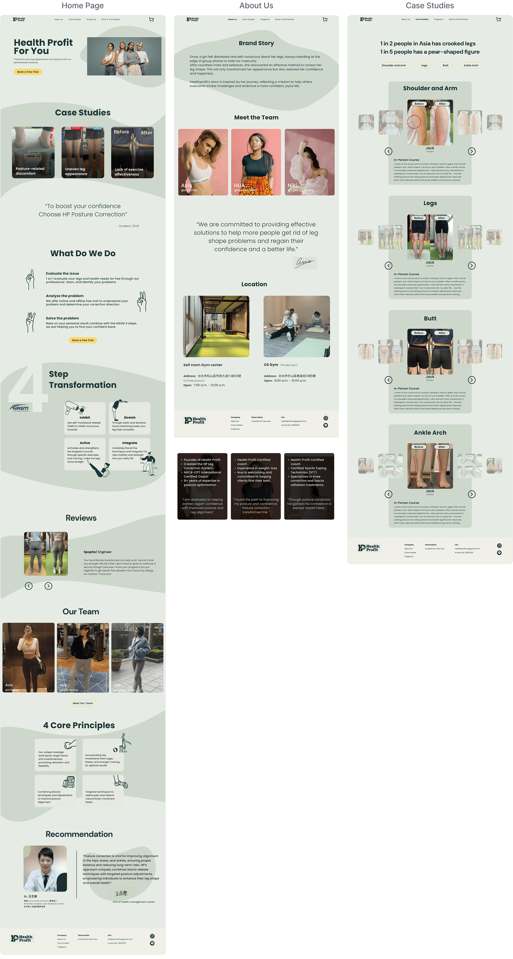
Before & After
Before & After
Redesigned key pages to improve content clarity, navigation flow, and conversion.
Redesigned key pages to improve content clarity, navigation flow, and conversion.
Simplified CTA to 'Book a Free Trial' for clarity
Restructured homepage content for clearer logic
Replaced stock illustrations with real case study photos
Simplified CTA to 'Book a Free Trial' for clarity
Restructured homepage content for clearer logic
Replaced stock illustrations with real case study photos

Restructured the layout for desktop, reducing excessive scrolling
Added hover-to-flip cards to reveal team before/after transformations
Restructured the layout for desktop, reducing excessive scrolling
Added hover-to-flip cards to reveal team before/after transformations

Restructured layout to work across desktop and mobile
Added categorized sections for direct navigation
Restructured layout to work across desktop and mobile
Added categorized sections for direct navigation

Consolidated course details and pricing into a pop-up overlay
Replaced separate purchase page with inline add-to-cart
Consolidated course details and pricing into a pop-up overlay
Replaced separate purchase page with inline add-to-cart

Final Design
Final Design
Final screens reflect the restructured homepage flow, simplified navigation, and updated CTA language.
Final screens reflect the restructured homepage flow, simplified navigation, and updated CTA language.

Interactive walkthrough of the redesigned desktop experience.
Interactive walkthrough of the redesigned desktop experience.
Impact & Reflection
Impact & Reflection
This project strengthened my ability to identify where a website loses users before they convert. By focusing on wording clarity, visual hierarchy, and content structure, I helped Healthprofit present their services more clearly to a broader audience, not just the existing clients.
The biggest learning was understanding how much small language changes, like renaming 'Book a Free Evaluation' to 'Free Trial', can lower the barrier for new users and how the right words can make a complex service feel accessible and approachable.