
Nutrition App Design
Nutrition App Design
Calorie tracking app focused on goal achievement
Calorie tracking app focused on goal achievement
A meal and calorie tracking app built from scratch, designed to make nutrition data trustworthy, logging frictionless, and local meal discovery effortless.
A meal and calorie tracking app built from scratch, designed to make nutrition data trustworthy, logging frictionless, and local meal discovery effortless.
Role
Role
Product Designer
Product Designer
Goal
Goal
Design an intuitive meal tracking app that builds habit and keeps users motivated to reach their body goals
To improve the user experience by creating a dashboard for better investment tracking
Problem
Problem
Users are not convinced by the accuracy of the nutrition data displayed and lack motivation to continue tracking their meals
Users are not convinced by the accuracy of the nutrition data displayed and lack motivation to continue tracking their meals
Tool
Tool
Figma, Maze, Notion, Google Docs
Figma, Maze, Notion, Google Docs
Research & Discovery
Research & Discovery
Conducted interviews with 8 users who work out and track their health, including frequent travelers, to understand how location and lifestyle affect nutrition tracking habits.
Conducted interviews with 8 users who work out and track their health, including frequent travelers, to understand how location and lifestyle affect nutrition tracking habits.
Conducted interviews with 8 users who work out and track their health, including frequent travelers, to understand how location and lifestyle affect nutrition tracking habits.
Key Findings
Key Findings
Accuracy and scientific backing matter more than feature quantity
Location-based suggestions are low priority, personalization beats proximity
Location-based suggestions are low priority, personalization beats proximity
Location-based suggestions are low priority, personalization beats proximity
Fat loss and body maintenance drive motivation, not calorie counting alone
Fat loss and body maintenance drive motivation, not calorie counting alone
Fat loss and body maintenance drive motivation, not calorie counting alone

Competitor Analysis
Competitor Analysis
All three competitors struggled with the same tradeoff: simpler apps lacked features, while feature-rich apps became overwhelming. Accuracy issues and complex logging appeared across the board, pointing to a clear gap for an app that is free, lightweight, and reliable.
All three competitors struggled with the same tradeoff: simpler apps lacked features, while feature-rich apps became overwhelming. Accuracy issues and complex logging appeared across the board, pointing to a clear gap for an app that is free, lightweight, and reliable.
All three competitors struggled with the same tradeoff: simpler apps lacked features, while feature-rich apps became overwhelming. Accuracy issues and complex logging appeared across the board, pointing to a clear gap for an app that is free, lightweight, and reliable.

Personas
Personas
3 personas were built to represent the core user split: a goal-driven tracker focused on fat loss, and a casual user who wants quick, trustworthy lookups without the commitment of full logging.
3 personas were built to represent the core user split: a goal-driven tracker focused on fat loss, and a casual user who wants quick, trustworthy lookups without the commitment of full logging.
3 personas were built to represent the core user split: a goal-driven tracker focused on fat loss, and a casual user who wants quick, trustworthy lookups without the commitment of full logging.


Brand System
Brand System
Moodboard
Moodboard

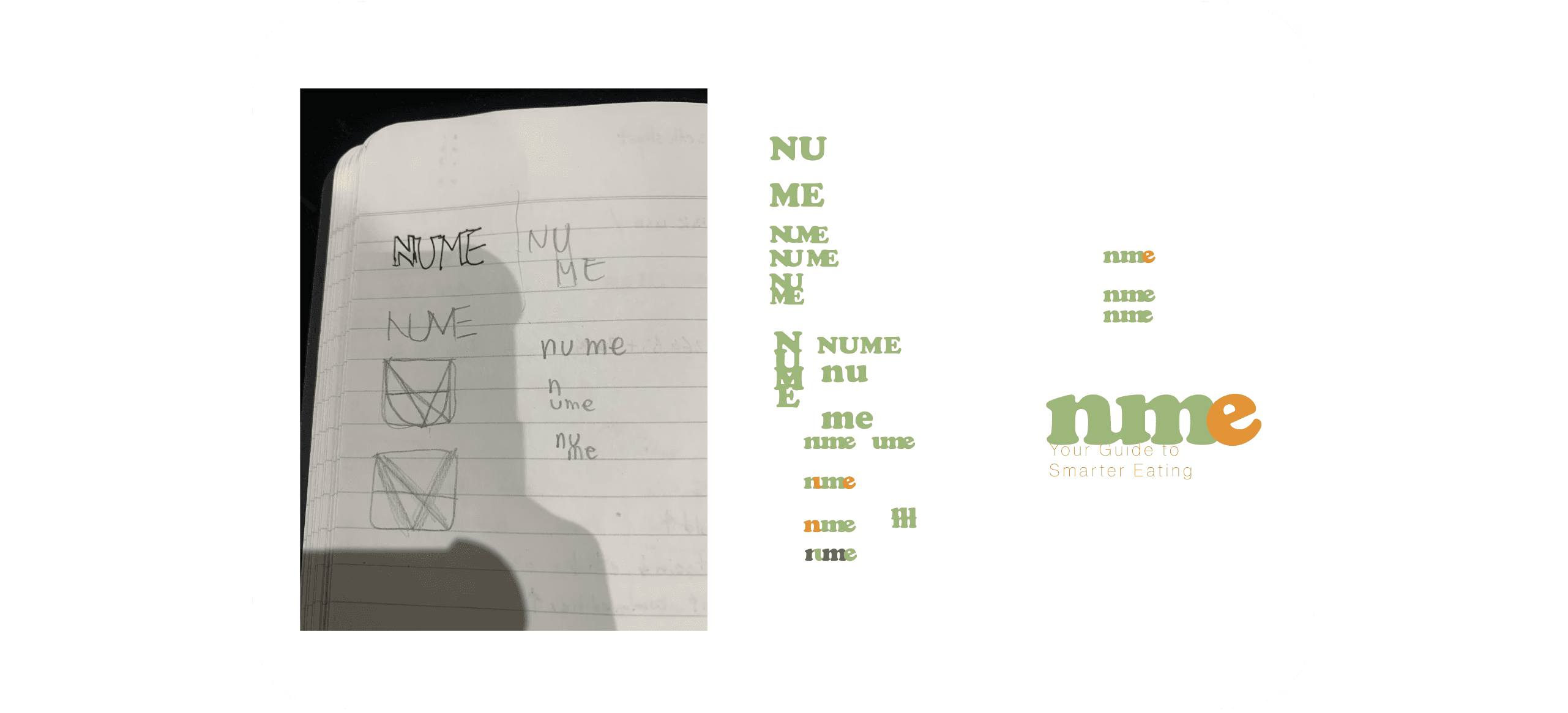
Logo
Logo
Lowercase letterforms establish a friendly, modern tone that feels personal rather than clinical. The tagline 'Track. Improve. Thrive.' captures the app's core loop: access nutritional data, log meals, and reach health goals.
Lowercase letterforms establish a friendly, modern tone that feels personal rather than clinical. The tagline 'Track. Improve. Thrive.' captures the app's core loop: access nutritional data, log meals, and reach health goals.
Lowercase letterforms establish a friendly, modern tone that feels personal rather than clinical. The tagline 'Track. Improve. Thrive.' captures the app's core loop: access nutritional data, log meals, and reach health goals.
Color Palette
Color Palette
Earthy greens and warm neutrals drawn from the moodboard reinforce themes of health, growth, and nourishment.
Earthy greens and warm neutrals drawn from the moodboard reinforce themes of health, growth, and nourishment.
Earthy greens and warm neutrals drawn from the moodboard reinforce themes of health, growth, and nourishment.

Typography
Typography
Cooper Black adds a playful, welcoming touch while Work Sans keeps the interface clean and highly readable, together balancing personality with clarity.
I aimed for a friendly, approachable, and easy-to-use experience. Cooper Black adds a playful, welcoming touch, while Work Sans, with subtle rounded details, keeps the design clean, modern, and highly readable.
Cooper Black adds a playful, welcoming touch while Work Sans keeps the interface clean and highly readable, together balancing personality with clarity.


Site map
Site map
Defined the full app structure before designing screens, ensuring search, logging, goal tracking, and food discovery each had a clear home.
Defined the full app structure before designing screens, ensuring search, logging, goal tracking, and food discovery each had a clear home.

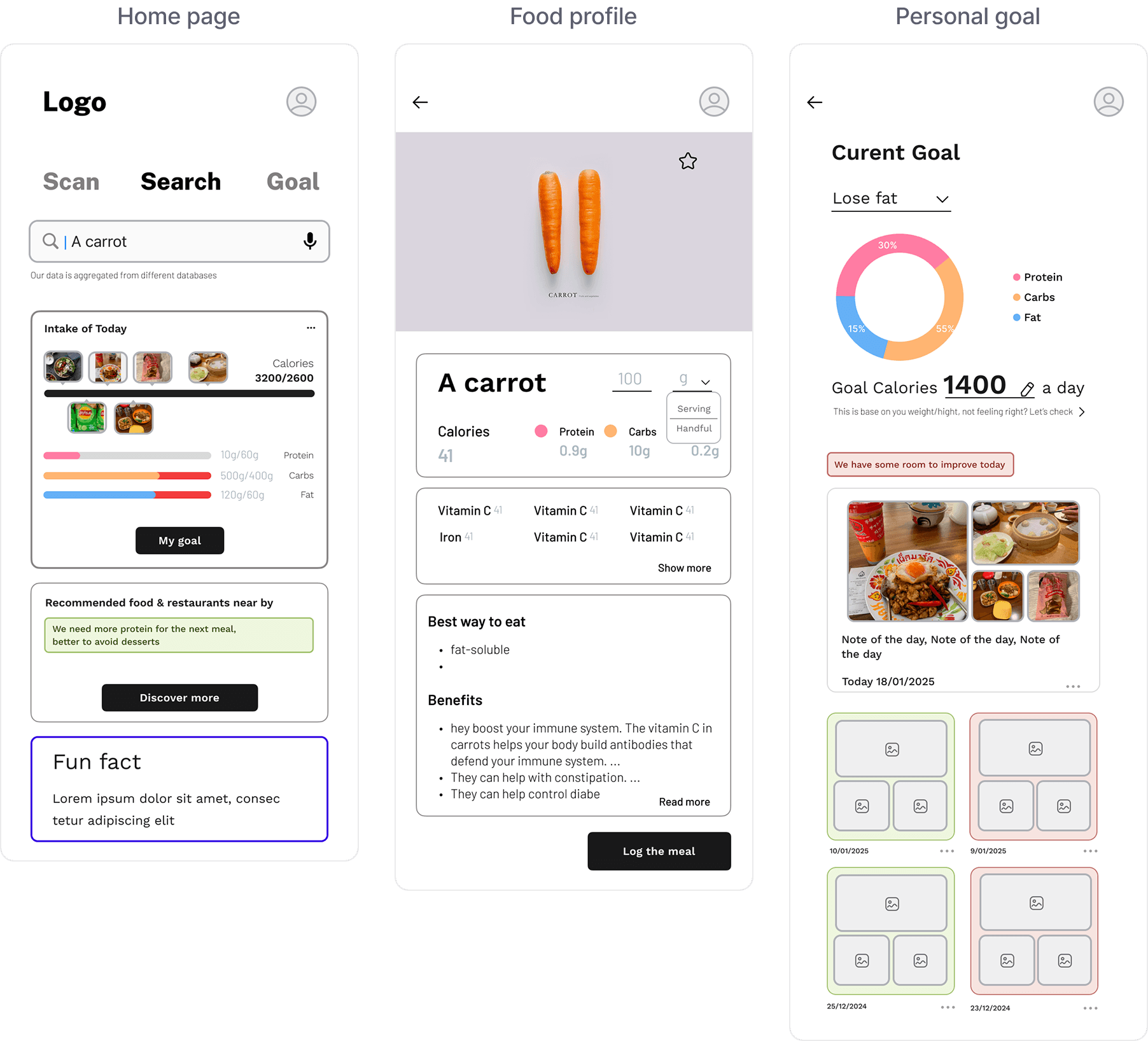
Wireframes
Wireframes
Sketched the home page, food profile, and goal views to establish layout and hierarchy before moving into visual design.
Sketched the home page, food profile, and goal views to establish layout and hierarchy before moving into visual design.
Sketched the home page, food profile, and goal views to establish layout and hierarchy before moving into visual design.
Final Design
Final Design
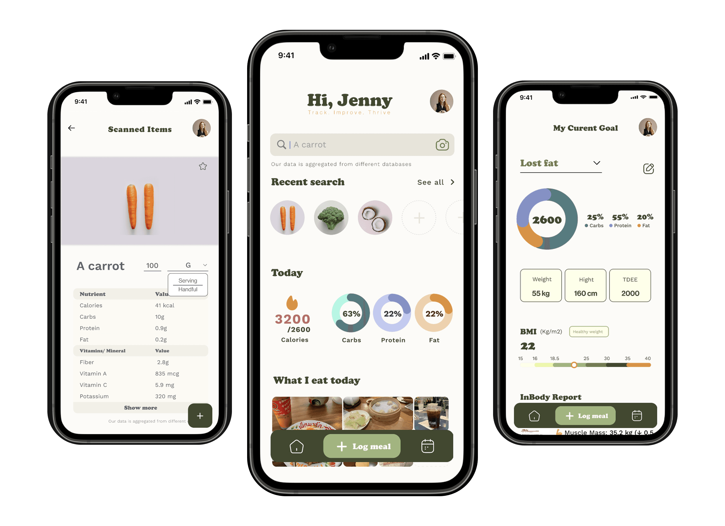
Home Page
Home Page
Restructured the home page to clarify its purpose and make key features immediately scannable, replacing the uncommon swipe navigation with a floating bar for direct access to Log Meal, Search, and Meal Journal.
Restructured the home page to clarify its purpose and make key features immediately scannable, replacing the uncommon swipe navigation with a floating bar for direct access to Log Meal, Search, and Meal Journal.
Restructured the home page to clarify its purpose and make key features immediately scannable, replacing the uncommon swipe navigation with a floating bar for direct access to Log Meal, Search, and Meal Journal.

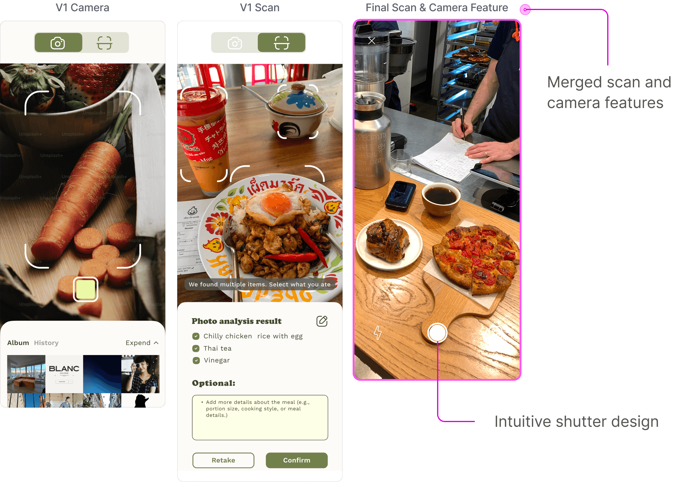
Meal logging
Meal logging
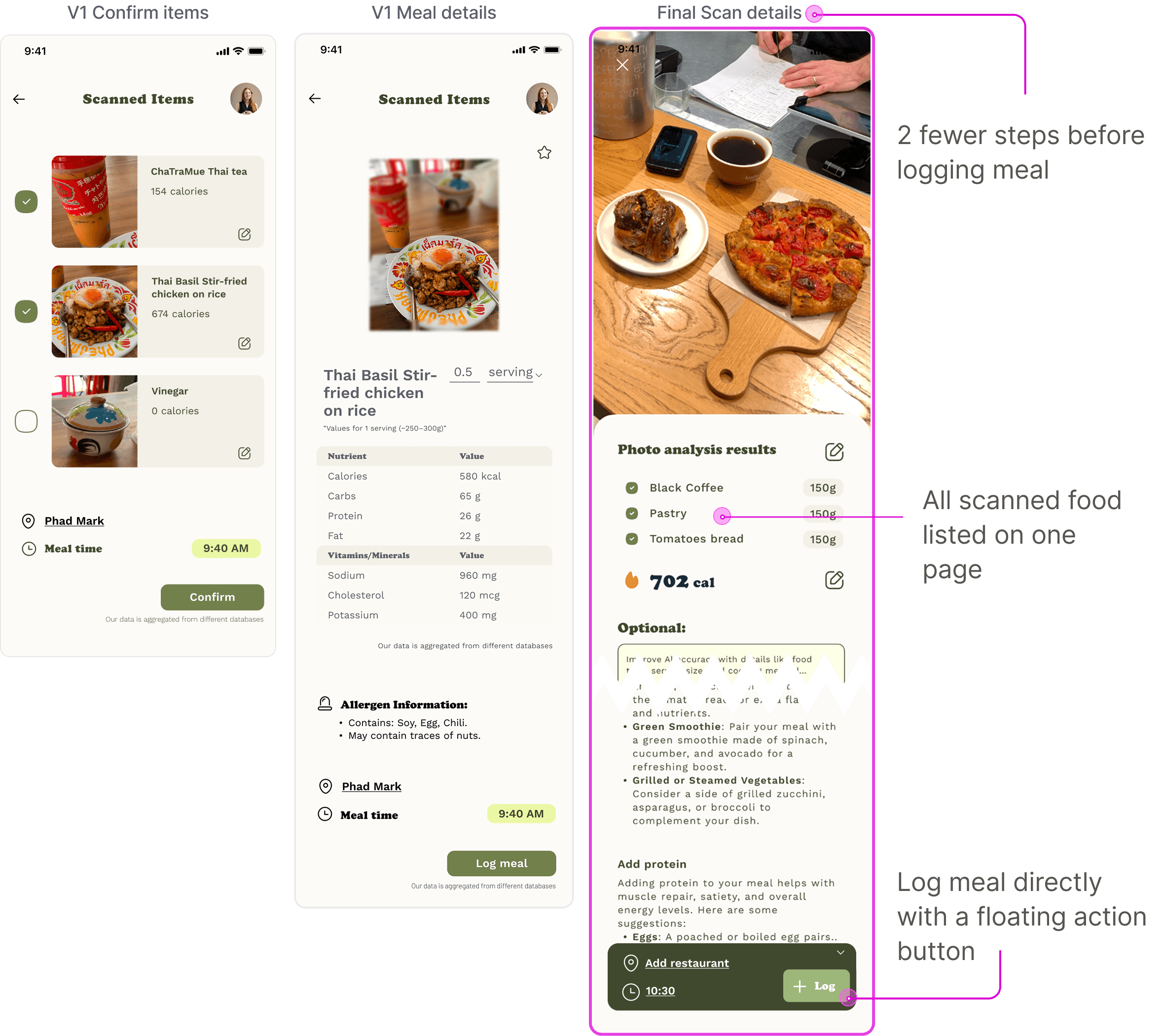
Merged scan and camera into a single flow and redesigned the shutter button for clarity, reducing confirmation steps to keep the logging process uninterrupted.
Merged scan and camera into a single flow and redesigned the shutter button for clarity, reducing confirmation steps to keep the logging process uninterrupted.
Goal and meal journal
Goal and meal journal
Separated Goal and Meal Journal into dedicated pages, allowing users to set goals more accurately and access meal history without friction.
Separated Goal and Meal Journal into independent pages, as they are key app features. The updated My Current Goal page allows users to set goals more accurately, with improved wording based on user interviews.
Separated Goal and Meal Journal into dedicated pages, allowing users to set goals more accurately and access meal history without friction.

Reflection
Impact and Reflection
This project reinforced that great UX is about making existing features more accessible and intuitive, rather than adding more. Initially, I tried fitting all features onto one screen, but user testing shifted my focus toward streamlining the experience. Through usability testing, I learned the importance of simplifying processes and reducing friction in meal tracking.
This project reinforced that great UX is about making existing features more accessible and intuitive, rather than adding more. Initially, I tried fitting all features onto one screen, but user testing shifted my focus toward streamlining the experience. Through usability testing, I learned the importance of simplifying processes and reducing friction in meal tracking.
This project reinforced that great UX is about making existing features more accessible and intuitive, rather than adding more. Initially, I tried fitting all features onto one screen, but user testing shifted my focus toward streamlining the experience. Through usability testing, I learned the importance of simplifying processes and reducing friction in meal tracking.