
Ensuro Investor Dashboard
Ensuro Investor Dashboard
Reducing user friction in portfolio tracking for a DeFi reinsurance platform
Reducing user friction in portfolio tracking for a DeFi reinsurance platform


Ensuro lacked a way for investors to track their portfolio performance. As an active user, designed the dashboard experience end to end, from research through prototype.
Ensuro is a blockchain-based, licensed (re)insurance company that aims to make insurance more accessible to the public, allowing anyone to invest in insurance risk and benefit from it.
Role
Role
Solo UX/UI designer
Solo UX/UI designer
Goal
Goal
Create a centralized dashboard to reduce friction in investment tracking
To improve the user experience by creating a dashboard for better investment tracking
Problem
Problem
Lack of a visible dashboard for investors to track their funds
Lack of a visible dashboard for investors to track their funds
Duration
Duration
5 weeks
5 weeks
Research & Discovery
Research & Discovery

The core problem
The core problem
Without a user portfolio overview, users struggle to track and manage their funds efficiently.
Without a user portfolio overview, users struggle to track and manage their funds efficiently.
What Users Said
What Users Said
“I have to click through multiple pools just to find out where my money is. I wish there was a simple way to see all my investments in one place.”
- Frequent Ensuro Users
“I have to click through multiple pools just to find out where my money is. I wish there was a simple way to see all my investments in one place.”
- Frequent Ensuro Users

The affinity map surfaced patterns across user pain points and unmet needs.
The affinity map surfaced patterns across user pain points and unmet needs.

Competitive Analysis
Competitive Analysis
Analysis of DeFi investment platforms identified dashboard as a standard feature missing from Ensuro's offering.
Analysis of DeFi investment platforms identified dashboard as a standard feature missing from Ensuro's offering.

Design Solution
Design Solution
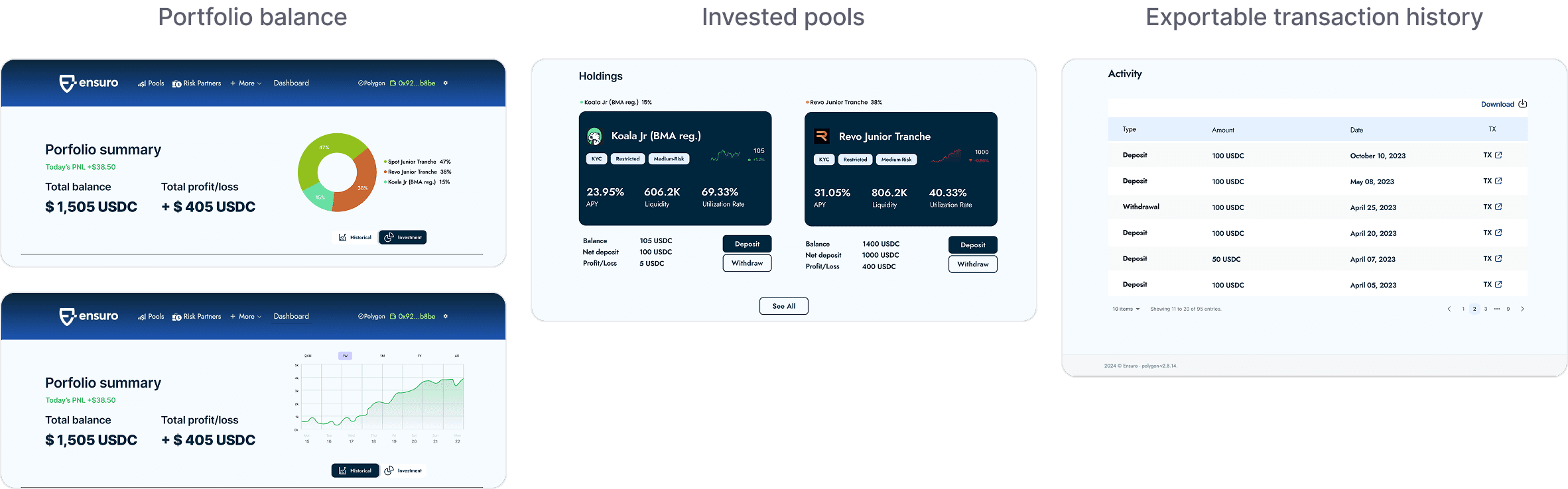
A centralized dashboard giving investors a real-time view of portfolio balance, invested pools, and transaction history, with direct deposit and withdrawal access and exportable reports.
A centralized dashboard giving investors a real-time view of portfolio balance, invested pools, and transaction history, with direct deposit and withdrawal access and exportable reports.
User Flow
User Flow
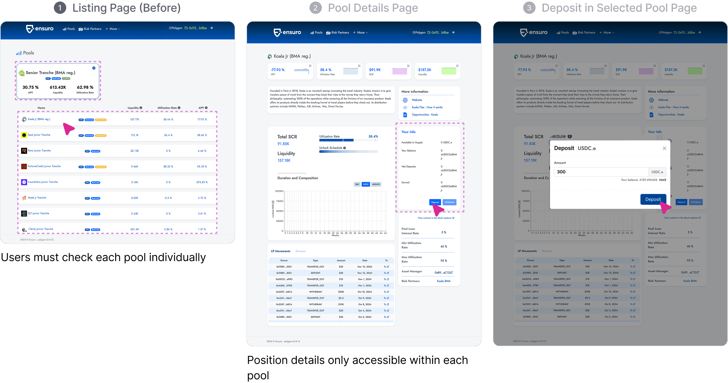
The original flow required investors to navigate back to the pool list each time they wanted to check balances or make deposits.
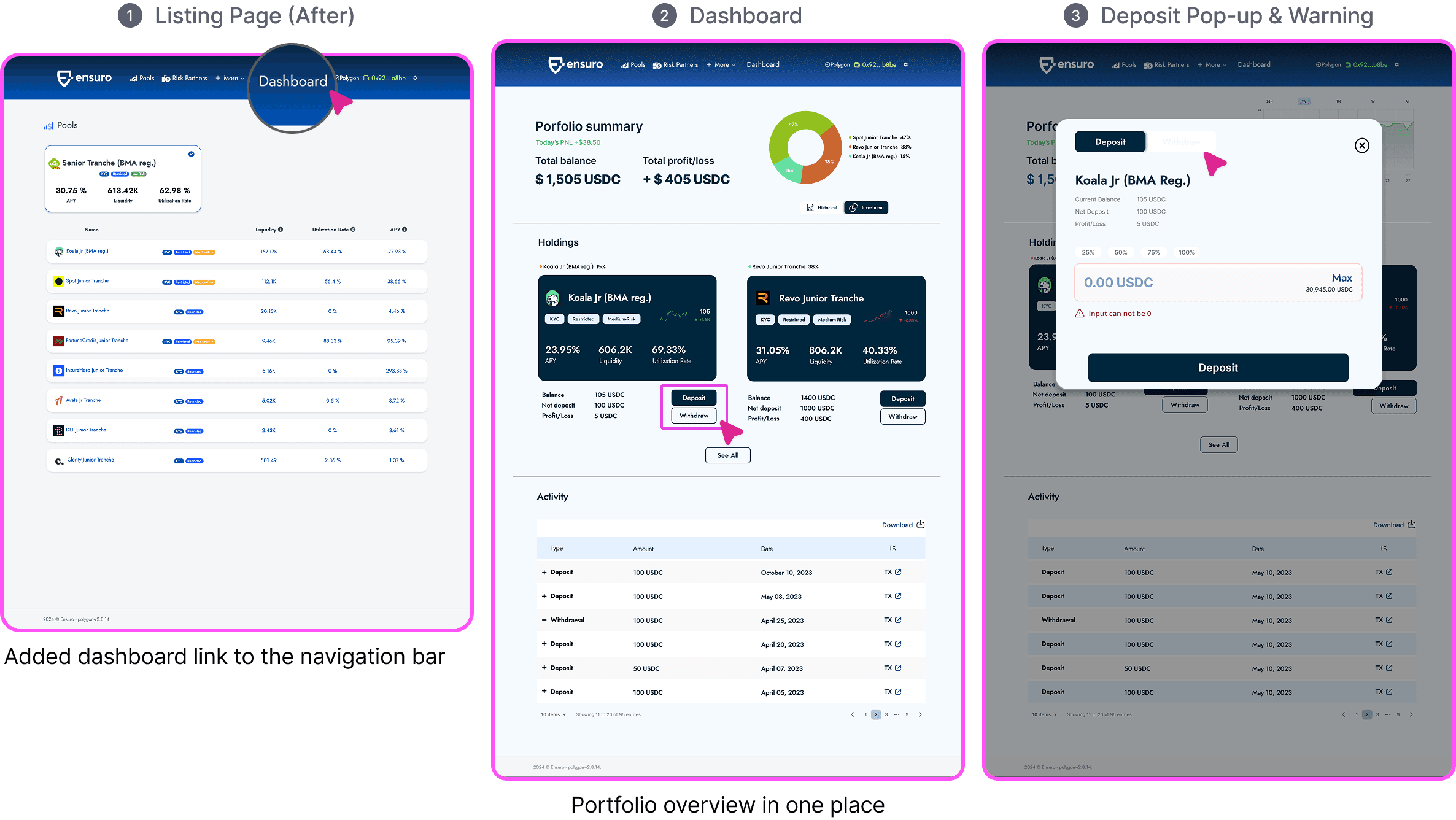
The new dashboard centralizes this, giving users a single view of all invested pools with direct access to deposit functions.
The original flow required investors to navigate back to the pool list each time they wanted to check balances or make deposits.
The new dashboard centralizes this, giving users a single view of all invested pools with direct access to deposit functions.

Before & After Flow
Before & After Flow
The original flow required navigating through individual pool pages to check balances or deposit. The dashboard consolidates both actions into a single entry point.
The original flow required navigating through individual pool pages to check balances or deposit. The dashboard consolidates both actions into a single entry point.
Design Iterations
Design Iterations
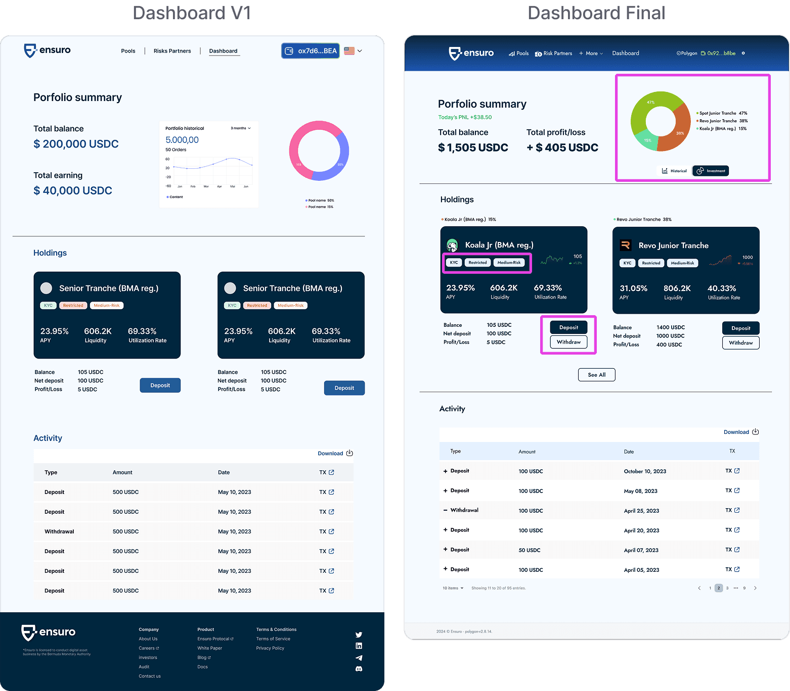
Key Improvements
Key Improvements
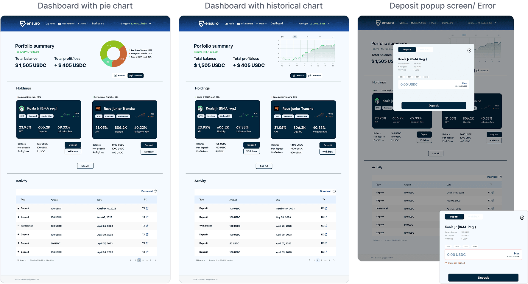
Enlarged pie chart and rebalanced button size
Added Deposit and Withdraw buttons for direct dashboard access
Reduced pool label color variations for visual consistency
Enlarged pie chart and rebalanced button size
Added Deposit and Withdraw buttons for direct dashboard access
Reduced pool label color variations for visual consistency
Key Improvements
Key Improvements
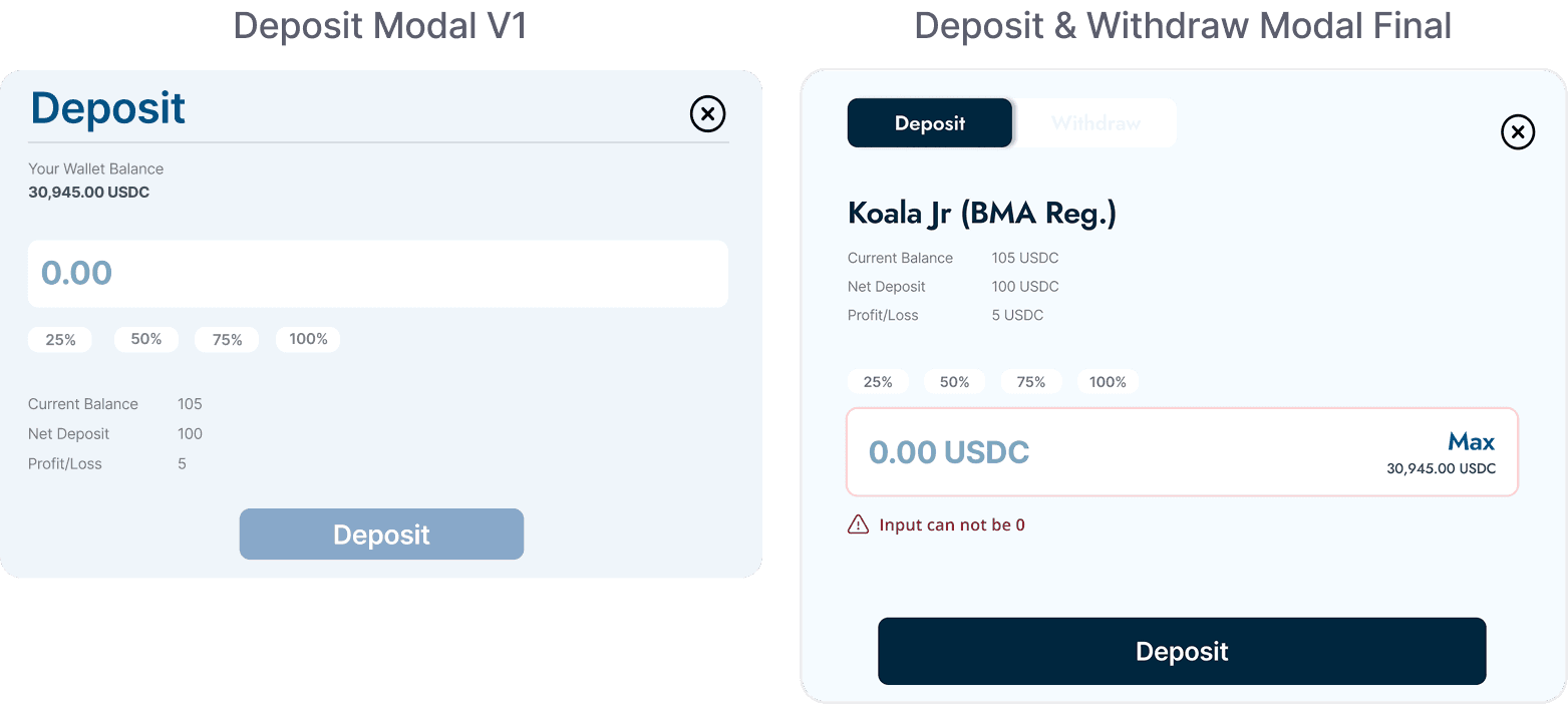
Replaced disabled button with inline warning
Combined Deposit and Withdraw into one modal
Added pool name to clarify transaction context
Replaced disabled button with inline warning
Combined Deposit and Withdraw into one modal
Added pool name to clarify transaction context
Final Design
Final Design
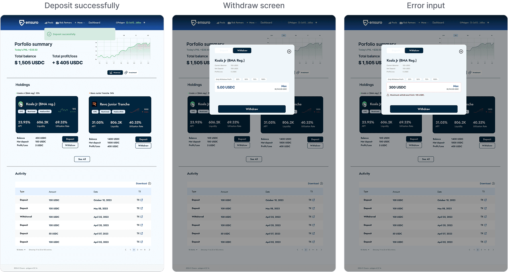
A walkthrough of the dashboard feature covering investment tracking, deposits, and reporting
A walkthrough of the dashboard feature covering investment tracking, deposits, and reporting
Impact
Impact and Reflection
This dashboard feature demonstrated measurable value to Ensuro, leading to an expanded engagement for a full website rebrand. The redesigned site with interactive elements increased time on page by 25-30%, while the portfolio dashboard reduced navigation friction for active investors.
Research showed two extremes: investors who built their own spreadsheets to track performance, and those who checked the site regularly despite the friction. The dashboard was designed for the space between, giving all users a reason to stay without requiring them to work around the product.
This dashboard feature demonstrated measurable value to Ensuro, leading to an expanded engagement for a full website rebrand. The redesigned site with interactive elements increased time on page by 25-30%, while the portfolio dashboard reduced navigation friction for active investors.
This project taught me the value of addressing both functional needs (tracking) and emotional needs (clarity), especially in crypto contexts where users often feel overwhelmed by technical jargon.