
Rebrand
Rebrand
Visual identity redesign for a crypto insurance platform
Visual identity redesign for a crypto insurance platform
More side-by-side comparisons?
[Jump to Before & After ↘︎]
More side-by-side comparisons?
[Jump to Before & After ↘︎]

After collaborating on a previous [Investor dashboard] project, the team brought me back for a complete website rebrand.
Ensuro is a blockchain-based, licensed (re)insurance company aiming to make insurance more accessible to the public, allowing anyone to invest in insurance risk and benefit from it.
Ensuro is a blockchain-based, licensed (re)insurance company that aims to make insurance more accessible to the public, allowing anyone to invest in insurance risk and benefit from it.
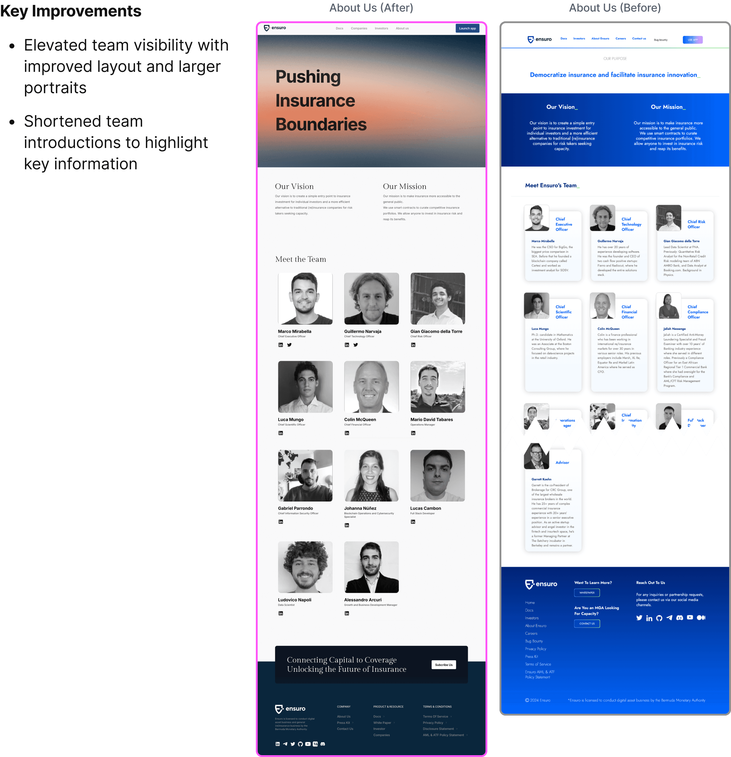
My experience as an Ensuro user informed my design decisions
This solo project, part of my DesignLab bootcamp, involved designing and adding a new feature to the Ensuro website. I handled everything from identifying the problem to UX research, visual design, and prototyping.
Role
Role
UX/UI Designer working closely with the CEO and BD team
UX/UI Designer working closely with the CEO and BD team
Goal
Goal
Redesign the visual identity and restructure content for better clarity and navigation
To improve the user experience by creating a dashboard for better investment tracking
Problem
Problem
No dedicated paths for either audience. Investors and companies were funneled to the same generic call to action with no content tailored to their needs
No dedicated paths for either audience. Investors and companies were funneled to the same generic call to action with no content tailored to their needs
Tool
Tool
Figma, Framer, Notion, Google Docs, Cloudflare
Figma, Framer, Notion, Google Docs, Cloudflare
COMPETITOR ANALYSIS
COMPETITOR ANALYSIS
Across all four competitors, dashboards were either too centralized and data-heavy, or buried under complex copy. Motion design was used effectively by some to simplify information display. The goal was to avoid the same density problems while borrowing the clarity that motion can bring to complex data.
Across all four competitors, dashboards were either too centralized and data-heavy, or buried under complex copy. Motion design was used effectively by some to simplify information display. The goal was to avoid the same density problems while borrowing the clarity that motion can bring to complex data.

The Problem
The Problem
One Site, Two Audiences
One Site, Two Audiences
The website served two distinct audiences, investors and companies, with no clear way to guide them to relevant content.
I decided to use 2 prominent CTA buttons on the hero section to guide each audience segment, rather than splitting into two separate sites.
Dense Content, Poor Navigation
Dense Content, Poor Navigation
Lengthy copy and unclear navigation made it difficult for users to find what they needed and understand Ensuro's value.
Lengthy copy and unclear navigation made it difficult for users to find what they needed and understand Ensuro's value.
Information Architecture
Information Architecture
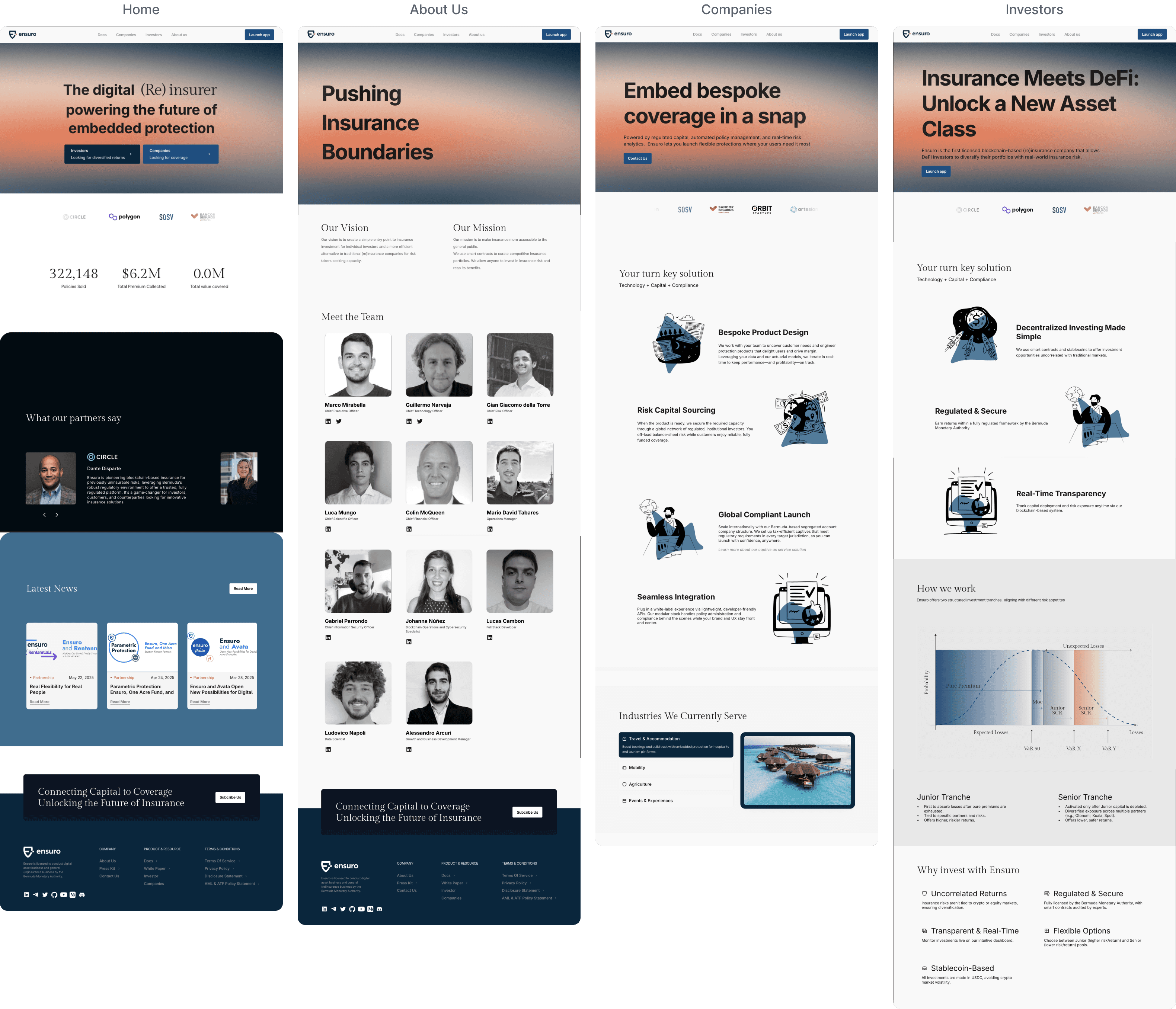
Reorganized navigation structure and homepage flow to serve two distinct audiences.
Reorganized navigation structure and homepage flow to serve two distinct audiences.
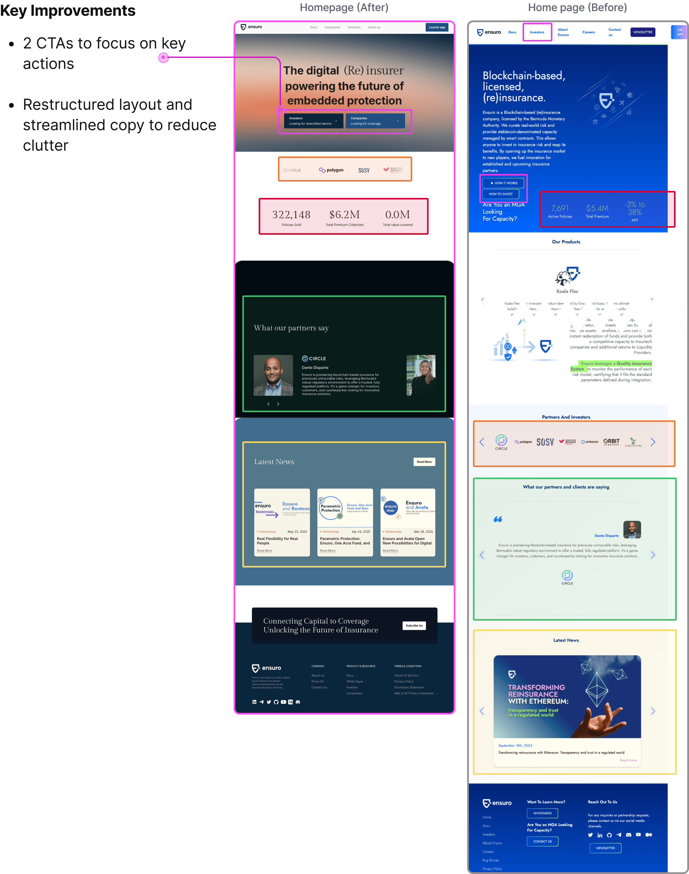
Home page
Home page
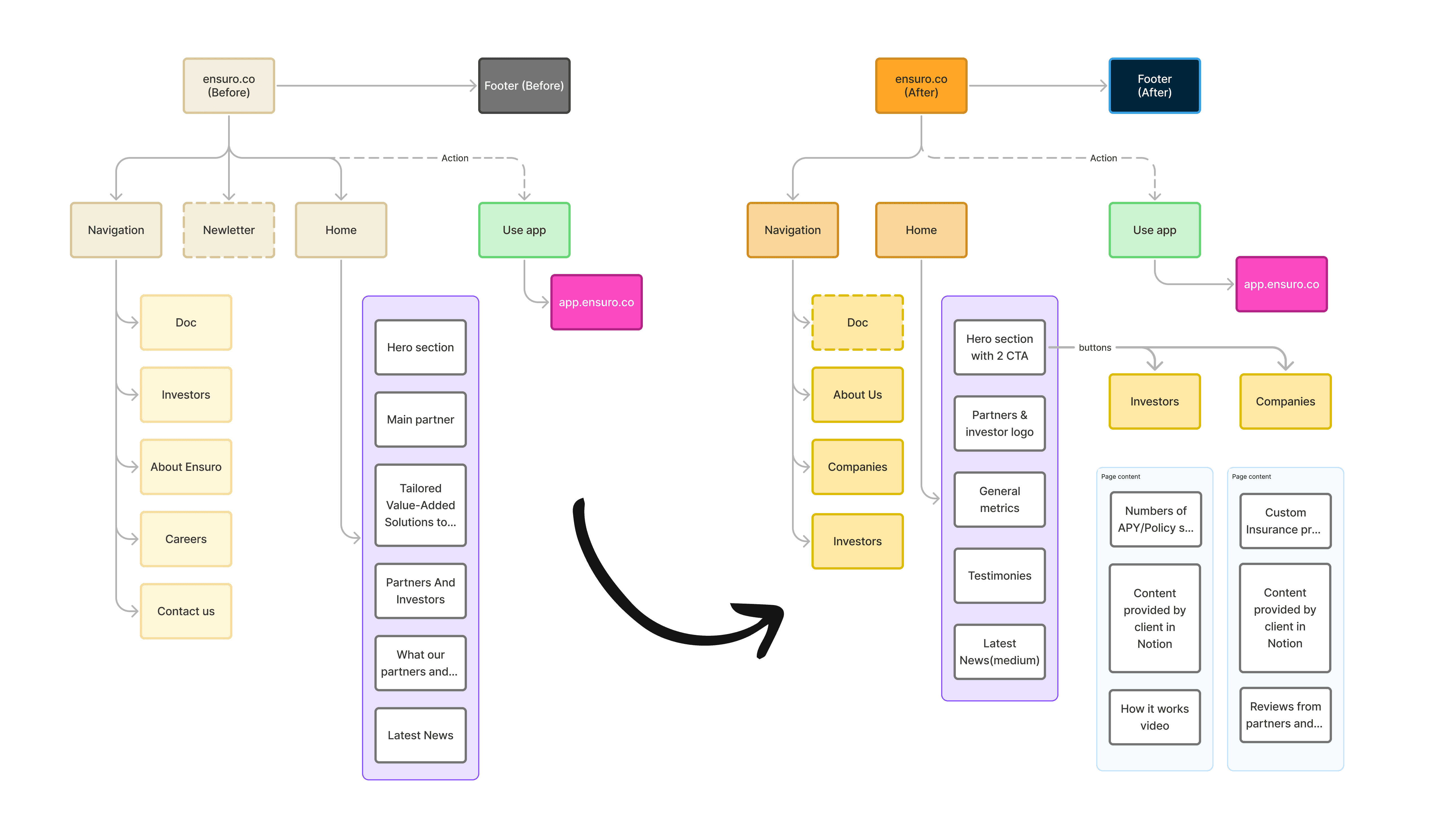
Before: Single generic entry point with all content mixed together
After: Two distinct CTAs guide investors and companies to tailored content paths
Before: Single generic entry point with all content mixed together.
After: Two distinct CTAs guide investors and companies to tailored content paths.
Footer
Footer
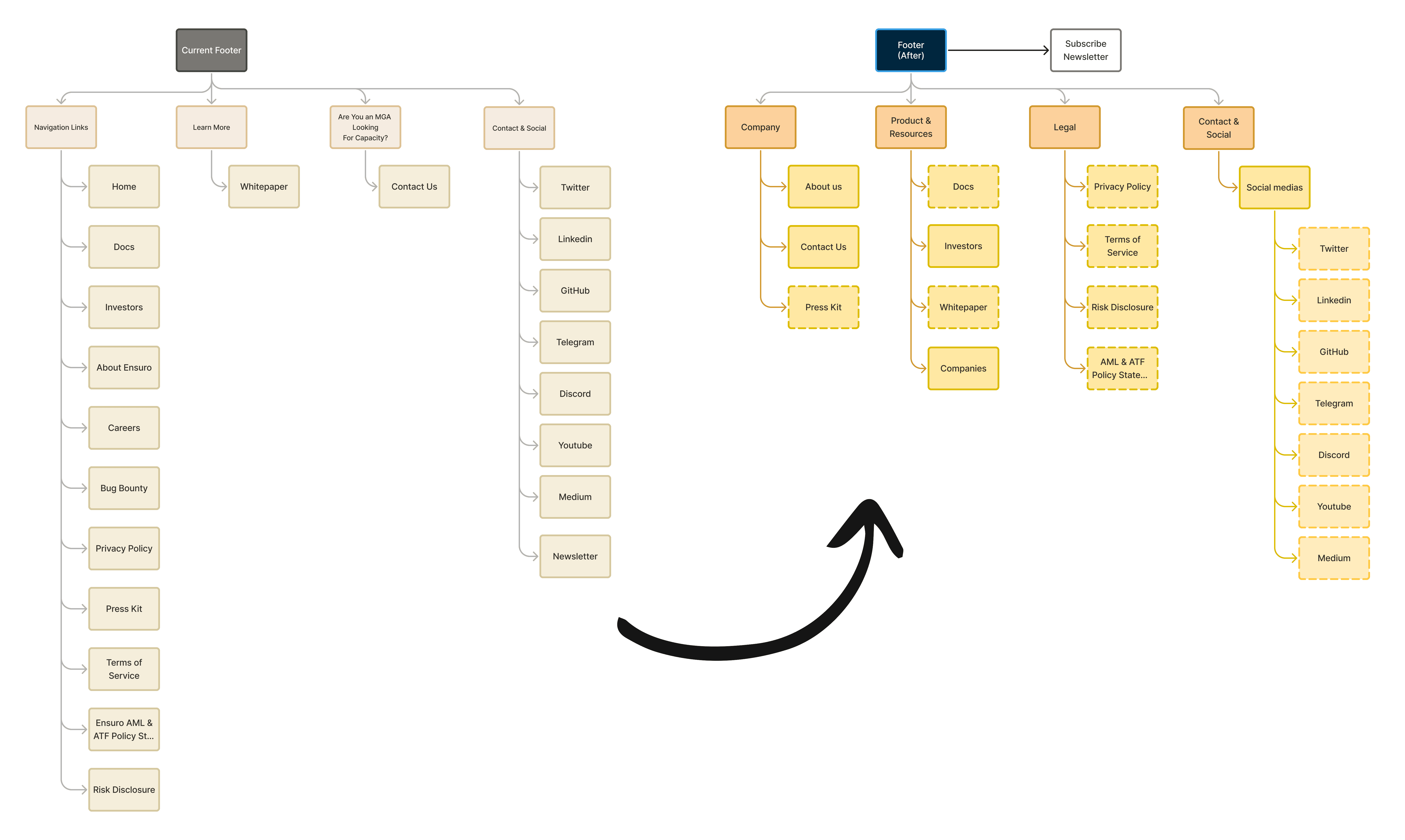
Before: All links listed in a single flat navigation with no clear grouping
After: Organized into 4 logical categories: Company, Product & Resources, Legal, and Contact & Social
Before: All links listed in a single flat navigation with no clear grouping.
After: Organized into four logical categories: Company, Product & Resources, Legal, and Contact & Social.
Wireframes
Wireframes
Exploring layout and interaction patterns before moving to high fidelity.
Exploring layout and interaction patterns before moving to high fidelity.

Brand System
Brand System
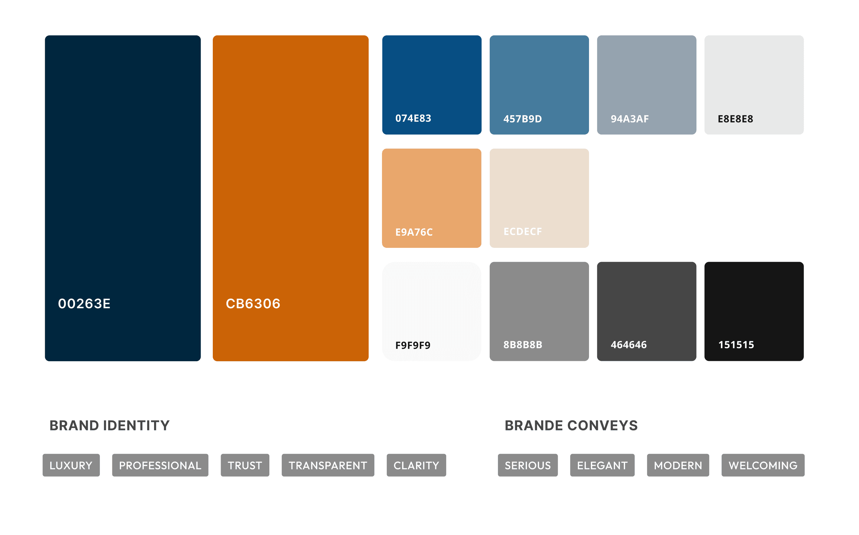
Refined Color Palette
Refined Color Palette
The existing blue and orange were refined to better reflect the brand's character without losing established brand recognition.
The existing blue and orange were refined to better reflect the brand's character without losing established brand recognition.
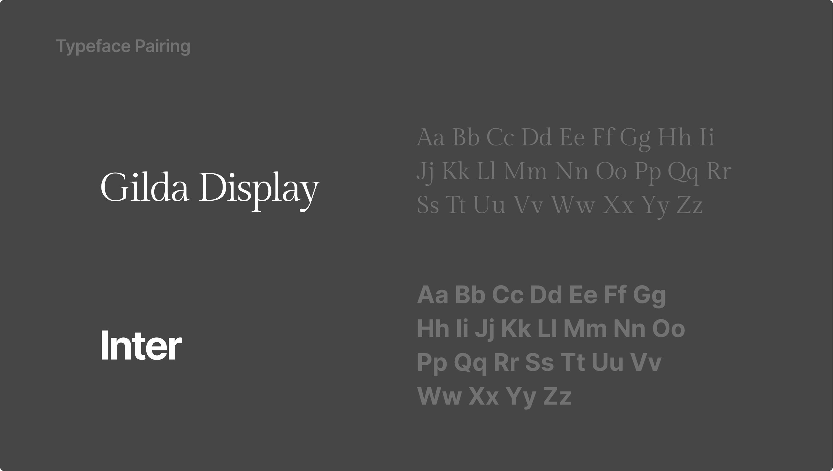
Typography Update
Typography Update
The original font, Jost, was too playful for an insurance business and compromised readability.
I replaced it with:
• Gilda Display for headlines
• Inter for body text
The original font, Jost, was too playful for an insurance business and compromised readability.
I replaced it with:
Gilda Display for headlines
Inter for body text
Motion Design & Prototyping
Motion Design & Prototyping
Applied the updated brand colors and content in Framer, then built motion design to bring the design system to life.
Applied the updated brand colors and content in Framer, then built motion design to bring the design system to life.
Before & After
Before & After
Final Design
Final Design
Built and animated in Framer to demonstrate real-time interaction and responsiveness.
Built and animated in Framer to demonstrate real-time interaction and responsiveness.
Impact
Impact
The redesign gave Ensuro a clearer brand presence and made their business model easier to understand for both investors and companies.
Working closely with the CEO and BD team taught me how to balance business priorities with user needs, and how to simplify a technically complex product without losing its credibility.